Study: Drawing Man-Chest
I've never been good at drawing man-chest. You can tell from some of my earlier work I haven't any godly idea how to depict that very um... vital part of attractive men without it looking grotesque. Since I constantly complain about men who can't draw women's breasts right without looking like a pair of helium balloons, it's only fair I learn to draw men's chest properly too. So today I decided to sit down and explore the secret of man-chest.
The first thing any reasonable artist does when learning a new topic is get some reference. A friend of mine recommended this website for sexy hunk wallpapers, of which there's plenty of man-chest on display without it actually being porn. If you want more detailed erm... reference, Google Image Search is your friend. I'd recommend googling something like "simple nude male" but be warned you'll be likely to get lots of porn results mixed in them.
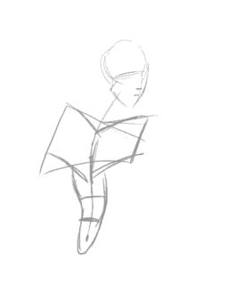
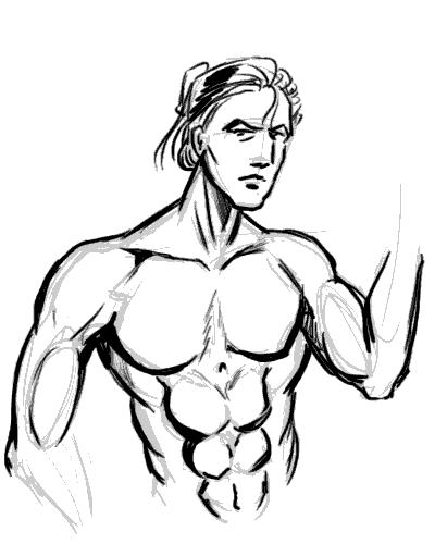
I picked the picture of this guy from the wallpapers website, because his posture is relatively natural and unobscured. Then I make a study of the chest by sketching it:
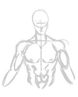
This is a very quick, very basic copy-sketch of the original picture. You can see where I used the construction lines to keep it aligned.
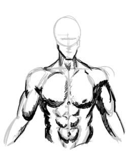
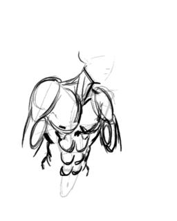
Next I do some shading in. This will help me understand the form of the muscles by studying the shadows and protrusions.
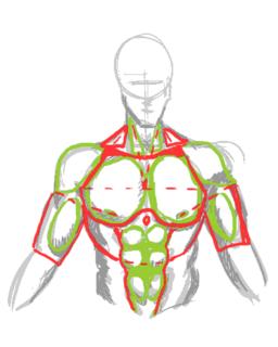
This is vitally important as I learn the geometric shapes that I will need to be able to memorise the overall form.
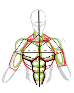
It's also good to study the symmetry lines so I know where to plonk the muscles the next time I draw wihout reference.
Okay we've done the study. Now to see if it pays off...
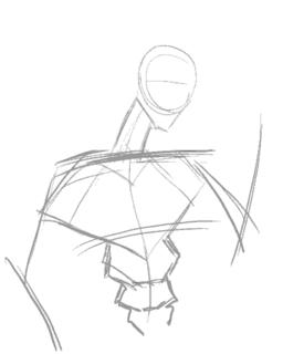
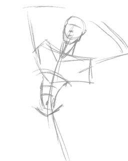
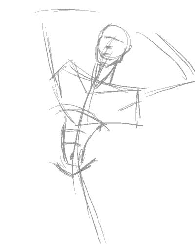
The position I chose to draw my next subject is slightly to the side. This is where the symmetry framework becomes important, sincei t allows me to be able to work out where all those muscles go when mapped out from a different angle:
Here's me loosely adding the muscles into the frame. It's not exactly accurate, but once the muscles are more or less in place, you can guess where to tweak.
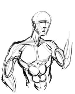
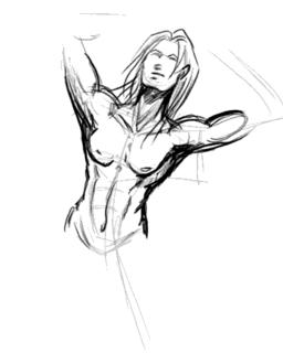
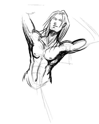
The end result. I'm not too happy with the result as the body seems too muscular for the guy's slimmish face. I'd really put more flesh onto the guy's cheek if he's that buff, really. Also, his shoulders look too narrow, making him look rather awful.

Note to self: Exaggerate shoulders for better effect.
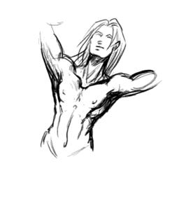
So let's try this again. This time with a slightly less ambitious posture...

I'm happy to say the second try came out much better, with the very broad shoulders working well to give this guy the "sculpted from marble" look of of a hardened warrior. I forgot to draw the nipples this time around, but for some reason missing nipples seem to be considered acceptable on men. However, since I whine about comic book women having no nipples, I won't be hypocritical and will make a mental note not to forget them in the future.
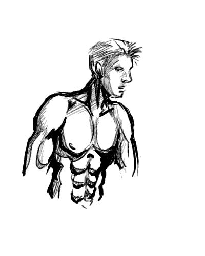
Now comes the REAL challenge, a not-overly muscly man-chest.
I'm quickly discovering that getting the frame in the right place is by far the most important factor in making the body look right.
Adding the memorized mucles and adjusting them to fit the posture. Drawing a less muscly build turns out to be the process of simplification. Instead of individually drawing the muscles, use suggestive lines to give the overall curves of the muscle masses (if you look at the earlier study-charts, they're the lines in red.)
Of course I quickly realise that unless the guy is fat, he doesn't have voluminious breasts and thus they should not sag as much as you'd expect with women. A little correction is in order:

Another interesting thing I never noticed before undertaking this study was that there is a little depression in the center of the chest. A cute little touch that gives balance to the belly button, IMHO.
Edit: Smight of Soulgrind Squeezebox pointed out that "Something you might consider though is that when the shoulders move in certain ways the pectorals stretch to follow the arm a bit more so that the defining lines benieth them should be thinner and sharper on chest disappearing near the center of the chest."
And he's right. This looks more right than my last attempt before this, I think... and handily solves my problem of "Man-boobs" on "man-chests".
At this point I'm quite happy with my new-found knowledge of drawing man-chest, and with good fortune, I should be able to draw better-looking men in the future. I hope you enjoyed this study/tutorial, and found it helpful. Any comments, questions, and suggestions for improvements are welcome.
Stay tuned for the next entry to my art journal and thanks for reading!
The first thing any reasonable artist does when learning a new topic is get some reference. A friend of mine recommended this website for sexy hunk wallpapers, of which there's plenty of man-chest on display without it actually being porn. If you want more detailed erm... reference, Google Image Search is your friend. I'd recommend googling something like "simple nude male" but be warned you'll be likely to get lots of porn results mixed in them.
I picked the picture of this guy from the wallpapers website, because his posture is relatively natural and unobscured. Then I make a study of the chest by sketching it:

This is a very quick, very basic copy-sketch of the original picture. You can see where I used the construction lines to keep it aligned.
Next I do some shading in. This will help me understand the form of the muscles by studying the shadows and protrusions.

This is vitally important as I learn the geometric shapes that I will need to be able to memorise the overall form.

It's also good to study the symmetry lines so I know where to plonk the muscles the next time I draw wihout reference.

Okay we've done the study. Now to see if it pays off...
The position I chose to draw my next subject is slightly to the side. This is where the symmetry framework becomes important, sincei t allows me to be able to work out where all those muscles go when mapped out from a different angle:

Here's me loosely adding the muscles into the frame. It's not exactly accurate, but once the muscles are more or less in place, you can guess where to tweak.

The end result. I'm not too happy with the result as the body seems too muscular for the guy's slimmish face. I'd really put more flesh onto the guy's cheek if he's that buff, really. Also, his shoulders look too narrow, making him look rather awful.
Note to self: Exaggerate shoulders for better effect.

So let's try this again. This time with a slightly less ambitious posture...

I'm happy to say the second try came out much better, with the very broad shoulders working well to give this guy the "sculpted from marble" look of of a hardened warrior. I forgot to draw the nipples this time around, but for some reason missing nipples seem to be considered acceptable on men. However, since I whine about comic book women having no nipples, I won't be hypocritical and will make a mental note not to forget them in the future.
Now comes the REAL challenge, a not-overly muscly man-chest.
I'm quickly discovering that getting the frame in the right place is by far the most important factor in making the body look right.

Adding the memorized mucles and adjusting them to fit the posture. Drawing a less muscly build turns out to be the process of simplification. Instead of individually drawing the muscles, use suggestive lines to give the overall curves of the muscle masses (if you look at the earlier study-charts, they're the lines in red.)
Of course I quickly realise that unless the guy is fat, he doesn't have voluminious breasts and thus they should not sag as much as you'd expect with women. A little correction is in order:
Another interesting thing I never noticed before undertaking this study was that there is a little depression in the center of the chest. A cute little touch that gives balance to the belly button, IMHO.
Edit: Smight of Soulgrind Squeezebox pointed out that "Something you might consider though is that when the shoulders move in certain ways the pectorals stretch to follow the arm a bit more so that the defining lines benieth them should be thinner and sharper on chest disappearing near the center of the chest."
And he's right. This looks more right than my last attempt before this, I think... and handily solves my problem of "Man-boobs" on "man-chests".

At this point I'm quite happy with my new-found knowledge of drawing man-chest, and with good fortune, I should be able to draw better-looking men in the future. I hope you enjoyed this study/tutorial, and found it helpful. Any comments, questions, and suggestions for improvements are welcome.
Stay tuned for the next entry to my art journal and thanks for reading!
posted by Ping @ Phalanx @ 5:37 PM
![]()


2 Comments:
At October 26, 2005 4:27 AM, Ping @ Phalanx said…
Thanks! I should be updating the blog when I have time. I'm current on a break from drawing, but the muse should be back to biting soon
At December 16, 2005 3:40 PM, Anonymous said…
This was really helpful! Between your tutorials and polykarbon, i should be able to ACTUALLY draw guys in no time!I can't wait for more of ur tutorials.
~Sheree
Post a Comment
<< Home