Drawing Comic Genesis Chan
Today I'm taking an hour or two off to draw a picture of Comic Genesis (Formerly Keenspace)'s mascot, Gen-Chan. I've also decided to use the opportunity to study women's anatomy from sideways.
I want to draw space-chan with a cannon over her shoulder, from a semi-sideways view, which I'm generally not good at, so A good reference is very important to get it right.
As usual, I turn to the internet for reference. Domai is a 'simple nudes' site, which by it's own definition presents "tasteful nudes of beautiful women". While it makes no pretense on who its target audience is, I find it very useful for finding references for female figures. Although not safe for work because of the well... nudity, the pictures aren't explicit, have good and varied postures and are generally on par with what you'd get in a life-drawing class or a life-drawing reference book.
Jops of The Menagerie drew the this rendition of Gen-chan. I'm going to follow his design.
Having found an image with a posture close enough to what I want, I start sketching on my tablet to get the basic wire frame.
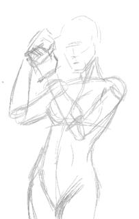
According to Jop's design, Gen has a snub nose, so I try and replicate it in a more realistic fashion. She also has a roundish face so I give her a heart-shaped face. I like having little imperfections in drawing characters, because it makes them more interesting.
I decided to dump the cannon and have her priming her wrist blaster instead.
Sadly the posture I chose blocks the logo she has on her costume, but... umm... oh well... bad planning, Ping. *sheepish grin*
The first stage is almost complete, so I check the posture and do some minor corrections, plus lots of cleaning up.
(By the way, you can click the images to see larger versions of sketches)
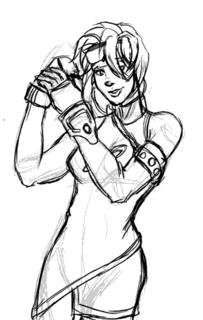
I briefy considered inking this with illustrator, but I decide for now I like the sketchy quality of the art and will colour it that way. Perhaps some other time I'll do the vector version.
Set the line art layer on multiply, and create a new layer beneath it for the foreground colours. I then colour in the large spaces with my paint bucket tool with set to "All Layers". I also have my brush set to "Behind" so I don't colour over areas I've already coloured when I do the smaller areas.
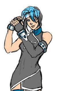
For the metallic areas I colour using magic wand set on "All Layers" and run it through an open-close algorithm. Someday I'll talk about what that does but not today. Let's just take it for granted it takes a selected area and gets rid of the little stray lines and stuff inside.
Now add different colours for the shadows. I've found using different colours on a opaque layer over the lineart instead of a black multiply layer makes for more colourful pictures. It also gives the image the "painted" quality I'm after.
Highlights are added next. I also burn the shading layers where I want it to be especially dark so they contrast well with the highlights. A background instead of blank white space is also good.
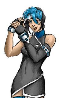
For some final touches we add the glowy effect (Screen layer) and a little frame.

And that's it. Blogger's thumbnailing system uses rather high JPEG compression, so the images look a little grainy, but as I mentioned, you can click on them to get the original image, which looks better. Now I'm off to submit this in case they're doing a rotation for the Comic Genesis front page!
Incidentally, the non-Blogger compressed version is here.
I want to draw space-chan with a cannon over her shoulder, from a semi-sideways view, which I'm generally not good at, so A good reference is very important to get it right.
As usual, I turn to the internet for reference. Domai is a 'simple nudes' site, which by it's own definition presents "tasteful nudes of beautiful women". While it makes no pretense on who its target audience is, I find it very useful for finding references for female figures. Although not safe for work because of the well... nudity, the pictures aren't explicit, have good and varied postures and are generally on par with what you'd get in a life-drawing class or a life-drawing reference book.
Jops of The Menagerie drew the this rendition of Gen-chan. I'm going to follow his design.
Having found an image with a posture close enough to what I want, I start sketching on my tablet to get the basic wire frame.

According to Jop's design, Gen has a snub nose, so I try and replicate it in a more realistic fashion. She also has a roundish face so I give her a heart-shaped face. I like having little imperfections in drawing characters, because it makes them more interesting.
I decided to dump the cannon and have her priming her wrist blaster instead.
Sadly the posture I chose blocks the logo she has on her costume, but... umm... oh well... bad planning, Ping. *sheepish grin*

The first stage is almost complete, so I check the posture and do some minor corrections, plus lots of cleaning up.

(By the way, you can click the images to see larger versions of sketches)
I briefy considered inking this with illustrator, but I decide for now I like the sketchy quality of the art and will colour it that way. Perhaps some other time I'll do the vector version.
Set the line art layer on multiply, and create a new layer beneath it for the foreground colours. I then colour in the large spaces with my paint bucket tool with set to "All Layers". I also have my brush set to "Behind" so I don't colour over areas I've already coloured when I do the smaller areas.

For the metallic areas I colour using magic wand set on "All Layers" and run it through an open-close algorithm. Someday I'll talk about what that does but not today. Let's just take it for granted it takes a selected area and gets rid of the little stray lines and stuff inside.

Now add different colours for the shadows. I've found using different colours on a opaque layer over the lineart instead of a black multiply layer makes for more colourful pictures. It also gives the image the "painted" quality I'm after.
Highlights are added next. I also burn the shading layers where I want it to be especially dark so they contrast well with the highlights. A background instead of blank white space is also good.

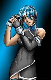
For some final touches we add the glowy effect (Screen layer) and a little frame.

And that's it. Blogger's thumbnailing system uses rather high JPEG compression, so the images look a little grainy, but as I mentioned, you can click on them to get the original image, which looks better. Now I'm off to submit this in case they're doing a rotation for the Comic Genesis front page!
Incidentally, the non-Blogger compressed version is here.
posted by Ping @ Phalanx @ 9:29 AM
![]()


0 Comments:
Post a Comment
<< Home