Study: Drawing the Human Foot
Ah, my great nemesis. The foot. Worse than the hand... mainly because I don't get to draw it as much.
So today I decided: "Enough of avoiding the monster!", sat down and devoted a couple hours to studying the human foot.
One thing I hate about drawing the foot is that it's so hard to find detailed tutorials on it. Most books devote pages after page of how to the draw the face, body and hands, but barely include a page on feet as an afterthought. Even the great Loomis glosses over it, which annoys me to no end.
So here I go, Google for reference (BTW, don't google "bare feet" on Image Search. Just... don't). After a solid hours of attempts at drawing feet I won;t bore you with, I realised several things.
1. From the front, the human feet are a major a pain in the ass to draw.
Seriously, that wasn't really a revelation, but I just realised that anew. But back to the other points:
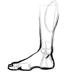
2. The human foot slants to the side.
There seems to be a line from the center of the foot to the center of the big toe which marks the split in directions the foot slants.
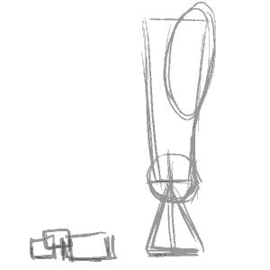
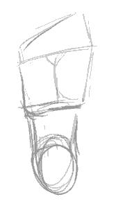
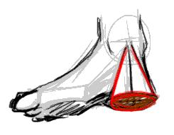
3. The heel is a cone.

I picked this one up from my copy of Action Cartooning by Ben Caldwell (An interesting book I'd recommend). The heel is sort of a cone, aligning with the leg bone at the point.
4. The human toes aren't just the bits you see at the end of the foot. They are connected to the pad thing at the base of the foot. (I never realised this before)
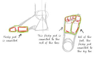
Don't forget to click on the image to read the notes I've scribbled on the diagrams. This is probably the most essential thing to understand to have the feet look right. Without the fleshy pads the feet don't look like feet.
5. The toes have joints. (Don't laugh, I should have known, but it just never occured to me)
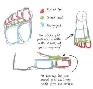
This is the thing that make toes look like toes. They have to look crimped, otherwise they look unnatural. There's got to be that knuckle like bump and the little gap between the fleshy pad and the toe ends.
So with this new-found info, I'm going to test it out by drawing a series of feet from different positions:
The side of the foot is relatively easy. The important thing is to lay out the fleshy pads and the heels in the right places. The big toe is also bigger than the flesh pad, so it overlaps it.
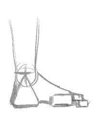
This is the side of the foot, but from the side of the little toe. More common in view than the other side, it's imparative to note the little toe is smaller than the fleshy pad so you can see a bit of it over the toe end and knuckles.

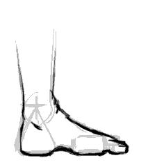
View of feet from the top. I'm told by a very reliable source (my podiatrist friend) that the fleshy pad sticks out so exaggerating it makes for more realistic -looking feet when there's an in-curve.
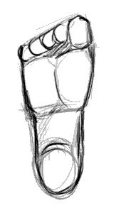
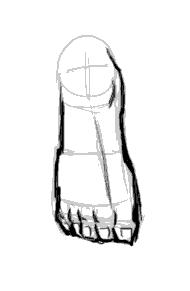
The sole. Not particularly interesting, other than being a good map of the layout of the fleshy pads and toes. Note the you can't really see the second joint of the big toe from this angle.
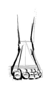
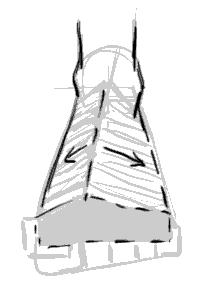
The most difficult view to draw the foot from. You need to have good grasp of geometry and perspective to be able to lay the shapes in line and get the right shape. Important things in making it look right is having the fleshy pad in the right place and showing that it's slightly wider than the toe rows.
And that's it. While I would not like to pass myself off as an expert in drawing feet, I'm reasonably happier and won't be dreading drawing feet the next time they come up in any of my art projects!
So today I decided: "Enough of avoiding the monster!", sat down and devoted a couple hours to studying the human foot.
One thing I hate about drawing the foot is that it's so hard to find detailed tutorials on it. Most books devote pages after page of how to the draw the face, body and hands, but barely include a page on feet as an afterthought. Even the great Loomis glosses over it, which annoys me to no end.
So here I go, Google for reference (BTW, don't google "bare feet" on Image Search. Just... don't). After a solid hours of attempts at drawing feet I won;t bore you with, I realised several things.
1. From the front, the human feet are a major a pain in the ass to draw.
Seriously, that wasn't really a revelation, but I just realised that anew. But back to the other points:
2. The human foot slants to the side.

There seems to be a line from the center of the foot to the center of the big toe which marks the split in directions the foot slants.
3. The heel is a cone.
I picked this one up from my copy of Action Cartooning by Ben Caldwell (An interesting book I'd recommend). The heel is sort of a cone, aligning with the leg bone at the point.
4. The human toes aren't just the bits you see at the end of the foot. They are connected to the pad thing at the base of the foot. (I never realised this before)

Don't forget to click on the image to read the notes I've scribbled on the diagrams. This is probably the most essential thing to understand to have the feet look right. Without the fleshy pads the feet don't look like feet.
5. The toes have joints. (Don't laugh, I should have known, but it just never occured to me)

This is the thing that make toes look like toes. They have to look crimped, otherwise they look unnatural. There's got to be that knuckle like bump and the little gap between the fleshy pad and the toe ends.
So with this new-found info, I'm going to test it out by drawing a series of feet from different positions:


The side of the foot is relatively easy. The important thing is to lay out the fleshy pads and the heels in the right places. The big toe is also bigger than the flesh pad, so it overlaps it.


This is the side of the foot, but from the side of the little toe. More common in view than the other side, it's imparative to note the little toe is smaller than the fleshy pad so you can see a bit of it over the toe end and knuckles.

View of feet from the top. I'm told by a very reliable source (my podiatrist friend) that the fleshy pad sticks out so exaggerating it makes for more realistic -looking feet when there's an in-curve.


The sole. Not particularly interesting, other than being a good map of the layout of the fleshy pads and toes. Note the you can't really see the second joint of the big toe from this angle.


The most difficult view to draw the foot from. You need to have good grasp of geometry and perspective to be able to lay the shapes in line and get the right shape. Important things in making it look right is having the fleshy pad in the right place and showing that it's slightly wider than the toe rows.
And that's it. While I would not like to pass myself off as an expert in drawing feet, I'm reasonably happier and won't be dreading drawing feet the next time they come up in any of my art projects!
posted by Ping @ Phalanx @ 3:40 PM
![]()


5 Comments:
At August 09, 2005 8:48 AM, Moshunter said…
hey, it's that foot you showed me in one of your comic!
At August 18, 2005 4:50 PM, Ping @ Phalanx said…
Well it is related. I was stuck at that page I showed you, so I sat down and this tutorial to learn how to do the feet.
After that, I went back and drew the foot in the comic I showed you ;)
At January 14, 2009 3:12 PM, Anonymous said…
thanks alot, couldnt get past the feet on drawings; big help
At July 03, 2009 12:26 PM, Anonymous said…
thanks you're great
At October 18, 2011 4:38 PM, Anonymous said…
Thanks, makes it simple to adapt to something
other than cartoon feet.
Post a Comment
<< Home