Ping Art: Ping Teo's Art Journal

Ping Teo has been teaching herself art after her A-Levels in Art and Design. This is her art journal where she records all her forays into drawing, inking, colouring and other forms of art and illustration and turns them into tutorials geared towards comics and graphic illustration.

Thursday, July 28, 2005

Study: Drawing the Male Torso (Sideways)

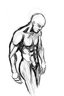
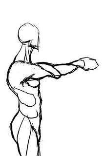
Today I'm sketching a logo image for The Longest Sojourn. So here's another grand opportunity for a study of the male anatomy again.


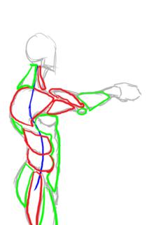
This is based off a reference picture, but some fun things to notice. End of the shoulder muscles (deltoids?) line up with the bottom of the breasts in an arc. You'll also notice I used the symmetry grids from the first study to draw the muscles in. The way of drawing the pelvis and leg-bones is a technique I picked up from Loomis' Mannikins. (Incidentally, Loomis' Figure Drawing For All Its Worth is an amazing book I'd recommend to anyone. You can learn loads off it if you don't mind the textbook approach.


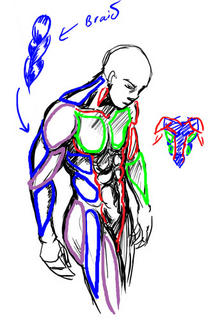
We'll ignore the muscles in green and red, since those were the ones we studied in the Man-Chest tutorial. What we want are the muscles in blue and purple, which are the side view ones.


One thing you'll notice is that from the side, the arm mucles sort of resemble a braid. From this angle the triceps are visible, and the lower arm muscles (It's actually a group of several muscles) stretch over from the end of the bicep to the elbow. This is not really anatomically accurate, but very much simplified. You want detailed muscles Loomis has a very detailed chart.

Another good thing to notice is the huge neck muscle stretching all the way from the nape of neck to the shoulder muscle. Memorise that one.

So from this study, we can summarise the visible muscles from the side as such:


And turn them into a chart for easy reference in the future.


Hopefully that makes it easier to draw the male figure from sideways.

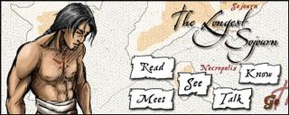
Incidentally, for those of you who wondered what was the outcome of this study:


This is the imagemap logo I got after I finished, which hopefully will feature on the next incarnation of the TLS website.

Monday, July 25, 2005

Drawing Comic Genesis Chan

Today I'm taking an hour or two off to draw a picture of Comic Genesis (Formerly Keenspace)'s mascot, Gen-Chan. I've also decided to use the opportunity to study women's anatomy from sideways.

I want to draw space-chan with a cannon over her shoulder, from a semi-sideways view, which I'm generally not good at, so A good reference is very important to get it right.

As usual, I turn to the internet for reference. Domai is a 'simple nudes' site, which by it's own definition presents "tasteful nudes of beautiful women". While it makes no pretense on who its target audience is, I find it very useful for finding references for female figures. Although not safe for work because of the well... nudity, the pictures aren't explicit, have good and varied postures and are generally on par with what you'd get in a life-drawing class or a life-drawing reference book.

Jops of The Menagerie drew the this rendition of Gen-chan. I'm going to follow his design.

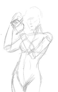
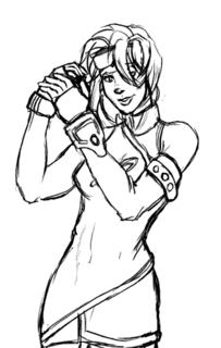
Having found an image with a posture close enough to what I want, I start sketching on my tablet to get the basic wire frame.


According to Jop's design, Gen has a snub nose, so I try and replicate it in a more realistic fashion. She also has a roundish face so I give her a heart-shaped face. I like having little imperfections in drawing characters, because it makes them more interesting.

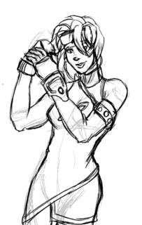
I decided to dump the cannon and have her priming her wrist blaster instead.

Sadly the posture I chose blocks the logo she has on her costume, but... umm... oh well... bad planning, Ping. *sheepish grin*


The first stage is almost complete, so I check the posture and do some minor corrections, plus lots of cleaning up.


(By the way, you can click the images to see larger versions of sketches)

I briefy considered inking this with illustrator, but I decide for now I like the sketchy quality of the art and will colour it that way. Perhaps some other time I'll do the vector version.

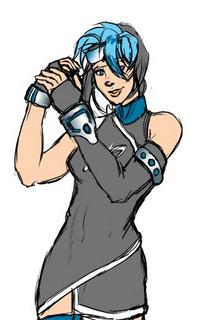
Set the line art layer on multiply, and create a new layer beneath it for the foreground colours. I then colour in the large spaces with my paint bucket tool with set to "All Layers". I also have my brush set to "Behind" so I don't colour over areas I've already coloured when I do the smaller areas.


For the metallic areas I colour using magic wand set on "All Layers" and run it through an open-close algorithm. Someday I'll talk about what that does but not today. Let's just take it for granted it takes a selected area and gets rid of the little stray lines and stuff inside.


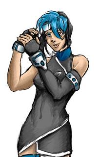
Now add different colours for the shadows. I've found using different colours on a opaque layer over the lineart instead of a black multiply layer makes for more colourful pictures. It also gives the image the "painted" quality I'm after.

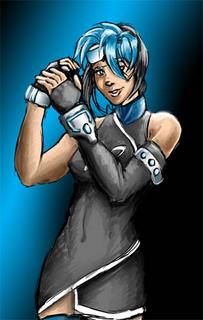
Highlights are added next. I also burn the shading layers where I want it to be especially dark so they contrast well with the highlights. A background instead of blank white space is also good.


For some final touches we add the glowy effect (Screen layer) and a little frame.


And that's it. Blogger's thumbnailing system uses rather high JPEG compression, so the images look a little grainy, but as I mentioned, you can click on them to get the original image, which looks better. Now I'm off to submit this in case they're doing a rotation for the Comic Genesis front page!

Incidentally, the non-Blogger compressed version is here.

Sunday, July 24, 2005

Study: Drawing Man-Chest

I've never been good at drawing man-chest. You can tell from some of my earlier work I haven't any godly idea how to depict that very um... vital part of attractive men without it looking grotesque. Since I constantly complain about men who can't draw women's breasts right without looking like a pair of helium balloons, it's only fair I learn to draw men's chest properly too. So today I decided to sit down and explore the secret of man-chest.

The first thing any reasonable artist does when learning a new topic is get some reference. A friend of mine recommended this website for sexy hunk wallpapers, of which there's plenty of man-chest on display without it actually being porn. If you want more detailed erm... reference, Google Image Search is your friend. I'd recommend googling something like "simple nude male" but be warned you'll be likely to get lots of porn results mixed in them.

I picked the picture of this guy from the wallpapers website, because his posture is relatively natural and unobscured. Then I make a study of the chest by sketching it:
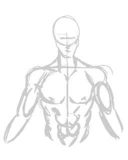


This is a very quick, very basic copy-sketch of the original picture. You can see where I used the construction lines to keep it aligned.

Next I do some shading in. This will help me understand the form of the muscles by studying the shadows and protrusions.
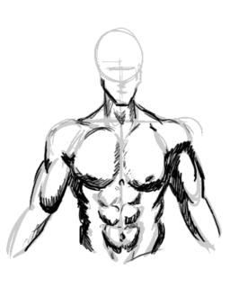


This is vitally important as I learn the geometric shapes that I will need to be able to memorise the overall form.
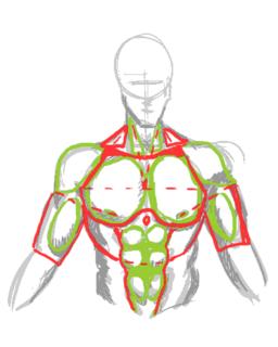


It's also good to study the symmetry lines so I know where to plonk the muscles the next time I draw wihout reference.
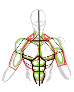


Okay we've done the study. Now to see if it pays off...

The position I chose to draw my next subject is slightly to the side. This is where the symmetry framework becomes important, sincei t allows me to be able to work out where all those muscles go when mapped out from a different angle:
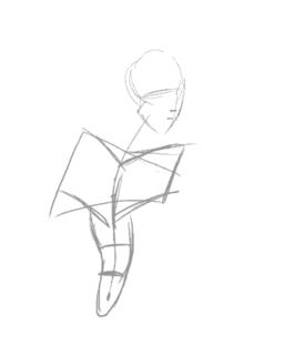


Here's me loosely adding the muscles into the frame. It's not exactly accurate, but once the muscles are more or less in place, you can guess where to tweak.
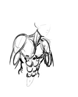


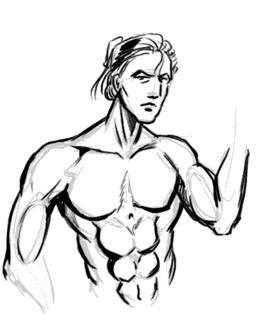
The end result. I'm not too happy with the result as the body seems too muscular for the guy's slimmish face. I'd really put more flesh onto the guy's cheek if he's that buff, really. Also, his shoulders look too narrow, making him look rather awful.
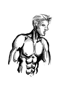


Note to self: Exaggerate shoulders for better effect.
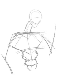


So let's try this again. This time with a slightly less ambitious posture...
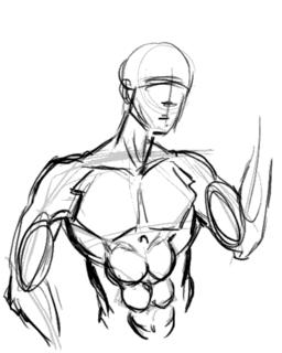


I'm happy to say the second try came out much better, with the very broad shoulders working well to give this guy the "sculpted from marble" look of of a hardened warrior. I forgot to draw the nipples this time around, but for some reason missing nipples seem to be considered acceptable on men. However, since I whine about comic book women having no nipples, I won't be hypocritical and will make a mental note not to forget them in the future.

Now comes the REAL challenge, a not-overly muscly man-chest.
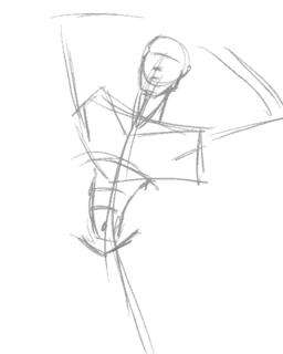


I'm quickly discovering that getting the frame in the right place is by far the most important factor in making the body look right.
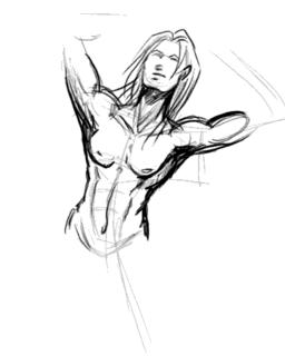


Adding the memorized mucles and adjusting them to fit the posture. Drawing a less muscly build turns out to be the process of simplification. Instead of individually drawing the muscles, use suggestive lines to give the overall curves of the muscle masses (if you look at the earlier study-charts, they're the lines in red.)

Of course I quickly realise that unless the guy is fat, he doesn't have voluminious breasts and thus they should not sag as much as you'd expect with women. A little correction is in order:
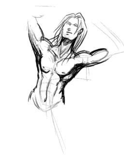


Another interesting thing I never noticed before undertaking this study was that there is a little depression in the center of the chest. A cute little touch that gives balance to the belly button, IMHO.

Edit: Smight of Soulgrind Squeezebox pointed out that "Something you might consider though is that when the shoulders move in certain ways the pectorals stretch to follow the arm a bit more so that the defining lines benieth them should be thinner and sharper on chest disappearing near the center of the chest."

And he's right. This looks more right than my last attempt before this, I think... and handily solves my problem of "Man-boobs" on "man-chests".
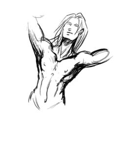


At this point I'm quite happy with my new-found knowledge of drawing man-chest, and with good fortune, I should be able to draw better-looking men in the future. I hope you enjoyed this study/tutorial, and found it helpful. Any comments, questions, and suggestions for improvements are welcome.

Stay tuned for the next entry to my art journal and thanks for reading!
Mission Statement and Index

So what is this, exactly?

I've decided to keep a journal... but it's an art journal. This is an attempt by me to replace my old Art Tutorials, with hope it'll make me easier to keep records of my art progress and write tutorials at the same time.

For those of you who don't know me, I'm Ping Teo. I do a couple of several online comics. I'm more well known for the Graphic Smash Series The Jaded, although I have more fun experimenting with my free Comic Genesis Comic The Longest Sojourn. I'm also involved in other comic projects such as the round-robin style comic Golden and parody How Not To Run a Comic on a on-off basis.

I don't consider myself a fantastic artist by any means. I'm still learning, which is why I thought keeping a journal might help me improve since I tend to forget stuff I've already learnt repeatedly.

Hopefully you'll find the rest of this interesting as well.


List of Topics Covered so Far:

  1. Study: Drawing Man-Chest
    The very popular Man-Chest tutorial. How to draw the muscles on the male torso.

  2. Step-By-Step: Drawing Comic Genesis Chan
    A step-by-step showing the basic steps of colouring methods. Not very detailed.

  3. Study: Drawing the Male Torso (Sideways)
    A continuation of the Man Chest Tutorial, but giving some attention to the sideways view of the torso.

  4. Study: Drawing the Human Foot
    A study of one my greatest drawing blocks. Breaking the feet down into managable sections so I can actually draw feet that resemble the real thing.