Ping Art: Ping Teo's Art Journal

Ping Teo has been teaching herself art after her A-Levels in Art and Design. This is her art journal where she records all her forays into drawing, inking, colouring and other forms of art and illustration and turns them into tutorials geared towards comics and graphic illustration.

Thursday, August 18, 2005

Quick Blurb: The Jaded Summer Afternoon Stories

Today I'm working on a page of The Jaded. "Summer Afternoon Stories" is a run of short stories I'm planning on having in-between chapter instead of "Outtakes". I'm also using this opportunity to try out some experimental stuff.

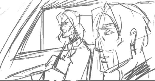
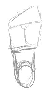
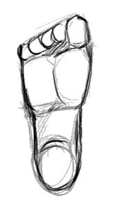
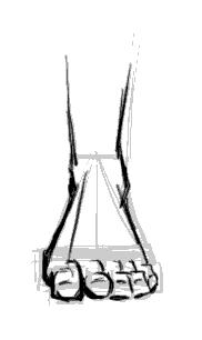
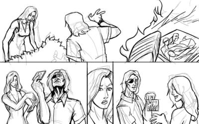
I'm drawing a page where Lysanne and Doc Ice are tramping around in the Lanner Place shrubbery looking for Lysanne's lost shoe. Why the shoe is lost I won't get into, but what's important is when they find the shoe they also find a chewed-up CD case.

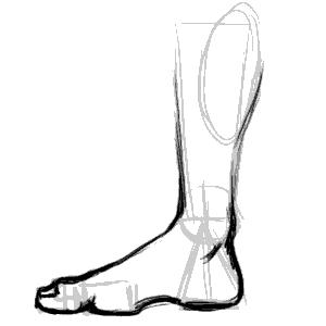
First, the preliminary scribbles:


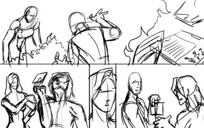
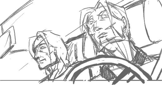
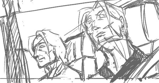
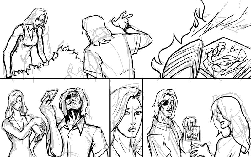
Then it's redrawing over the lines on a different layer:


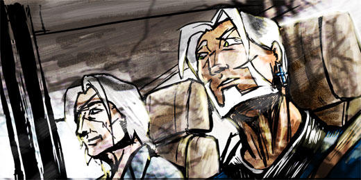
And then we add colours. I'm using the experimental washy-white colouring style to get a sketchy look for the comic. Ironically it takes me more time in the normal method I use for colouring, but such is experimentation.


I think the hard thing about not using heavy colour is having to restrict my use of the colours. I'm using the colours as the shadows, and by deafult everything else is white. It's like colours, you try to work with less and let the viewer's brain fill in the gap. Tricky. Full colour is so much more easier.

And that's it for today.

Wednesday, August 03, 2005

Quick Note on Composition: The Importance of Camera Angles

So here I am drawing the last page of The Jaded Chapter 3: Black Earth.

The scene I'm trying to illustrate is Doc Ice sitting in the passenger seat of a car, with Jade in the driver's seat and his crucifix earring very visible. Jade asks Ice a question, Doc answers cryptically.

So here's the preliminary sketch (digital equivalent of a penciled sketch) that I use for layouts.


As you can see, there's nothing particularly wrong with this composition. Everything that needs to be depicted is being depicted, but for some reason, the whole scene just looks rather... boring. It's flat and there's nothing particularly interesting about it.

So I decide to give the same scene a second go, this time using a different camera angle and a more dramatic viewpoint. The result:


I really liked this composition. It's important to note that the steering wheel in the foreground helps break up the motony and gives the panel more depth. Unfortunately, at this point, I realise:

  1. British cars have the driver's seat on the right side
  2. I can't flip the image because Jade's earring is on the left ear.
  3. Jade is supposedly nursing a recently broken arm, and shouldn't be driving anyway


Ok you can laugh at me now. So for the sake of consistency we relegate the two to the back seat, and someone else (presumably Juno or Lysanne) will be driving.


This is kind of a blow because that means I have to remove my steering wheel, but adding the window and the little rain shield at the top of it will help give a kind of frame to the picture. The result is a more 'closed' look, and hence a less empty-looking panel and better comic page overall.

Now back I go to sketching, or T won't be pleased at the state of my buffer! ;)

Edit: Thought you might be interested in the final result. I added theoverlay of the trees to give it a reflection-on-the-glass effect. Since it was the last page I thought it deserved something special.


Edit 2: Abby and Mos pointed out the perspective error on Jade's face which I missed, so here's the correction.


Having my mistakes pointed out to be is great, BTW. I can't improve without knowing what I'm doing wrong!

Tuesday, August 02, 2005

Study: Drawing the Human Foot

Ah, my great nemesis. The foot. Worse than the hand... mainly because I don't get to draw it as much.

So today I decided: "Enough of avoiding the monster!", sat down and devoted a couple hours to studying the human foot.

One thing I hate about drawing the foot is that it's so hard to find detailed tutorials on it. Most books devote pages after page of how to the draw the face, body and hands, but barely include a page on feet as an afterthought. Even the great Loomis glosses over it, which annoys me to no end.

So here I go, Google for reference (BTW, don't google "bare feet" on Image Search. Just... don't). After a solid hours of attempts at drawing feet I won;t bore you with, I realised several things.

1. From the front, the human feet are a major a pain in the ass to draw.

Seriously, that wasn't really a revelation, but I just realised that anew. But back to the other points:

2. The human foot slants to the side.


There seems to be a line from the center of the foot to the center of the big toe which marks the split in directions the foot slants.

3. The heel is a cone.


I picked this one up from my copy of Action Cartooning by Ben Caldwell (An interesting book I'd recommend). The heel is sort of a cone, aligning with the leg bone at the point.

4. The human toes aren't just the bits you see at the end of the foot. They are connected to the pad thing at the base of the foot. (I never realised this before)


Don't forget to click on the image to read the notes I've scribbled on the diagrams. This is probably the most essential thing to understand to have the feet look right. Without the fleshy pads the feet don't look like feet.

5. The toes have joints. (Don't laugh, I should have known, but it just never occured to me)


This is the thing that make toes look like toes. They have to look crimped, otherwise they look unnatural. There's got to be that knuckle like bump and the little gap between the fleshy pad and the toe ends.

So with this new-found info, I'm going to test it out by drawing a series of feet from different positions:


The side of the foot is relatively easy. The important thing is to lay out the fleshy pads and the heels in the right places. The big toe is also bigger than the flesh pad, so it overlaps it.


This is the side of the foot, but from the side of the little toe. More common in view than the other side, it's imparative to note the little toe is smaller than the fleshy pad so you can see a bit of it over the toe end and knuckles.


View of feet from the top. I'm told by a very reliable source (my podiatrist friend) that the fleshy pad sticks out so exaggerating it makes for more realistic -looking feet when there's an in-curve.


The sole. Not particularly interesting, other than being a good map of the layout of the fleshy pads and toes. Note the you can't really see the second joint of the big toe from this angle.


The most difficult view to draw the foot from. You need to have good grasp of geometry and perspective to be able to lay the shapes in line and get the right shape. Important things in making it look right is having the fleshy pad in the right place and showing that it's slightly wider than the toe rows.

And that's it. While I would not like to pass myself off as an expert in drawing feet, I'm reasonably happier and won't be dreading drawing feet the next time they come up in any of my art projects!